Two issues here to address.
-
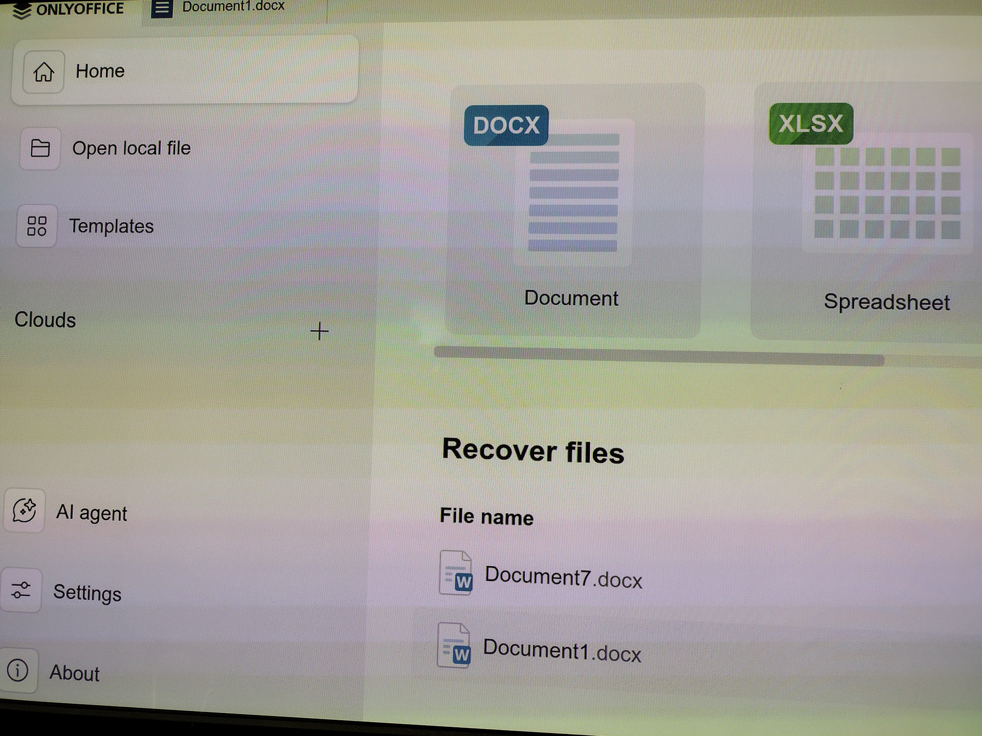
The OnlyOffice layout screams to be resized. See picture. There are needlessly huge icons for new documents which consume 40% of the page for 3 icons, and a needlessly huge sidebar consuming 40% of the page, yet I have to scroll down comparatively absurdly small to find recent documents utilizing maybe 20% of the page. This interface really needs to be resized to smaller new document icons, a smaller sidebar, and a larger visible list of recently used documents. The icons could use 10%, the sidebar, 10%, and the remainder 80% could be used for recent documents and layered tabs (see improvement #2)
-
Likewise, the interface needs layered document tabs because there’s only room for about 5 or so open documents before they crowd off of the single line of tabs. Layered tabs would address and fix this obvious annoying issue. At least 2 but even 3-4 layers of tabs allowing for 15-20 documents would be a fantastic improvement and use of the space.