I would like to suggest an improvement to the font selector interface that would significantly enhance usability.
Current situation
Currently, the font selector displays each font style as a separate entry. For example:
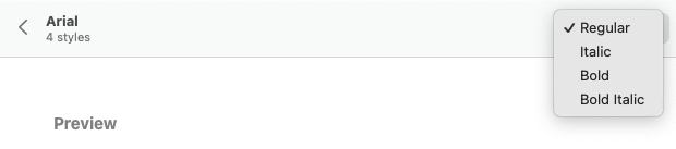
Arial
Arial Bold
Arial Italic
Arial Bold Italic
Calibri
Calibri Bold
Calibri Italic
etc.
This creates a very long list that makes it difficult to:
Quickly find a specific font family
Browse through available fonts efficiently
Understand which fonts are actually installed
Access frequently used fonts quickly
Suggested improvements
1. Group fonts by family
Display fonts grouped by family, similar to how Microsoft Outlook and Google Docs handle this:
Display only the font family name (e.g., “Arial”, “Calibri”, “Times New Roman”)
On a click, display the different style available (Light, Light italic, Regular, Italic, SemiBold, …)
Keep the separate style buttons (Bold, Italic, Underline) for applying styles
The dropdown would be much shorter and easier to navigate
2. Show recently used fonts at the top
Add a “Recent Fonts” section at the top of the font selector showing the 5 most recently used font families, separated from the main list by a divider.
This pattern is used by:
Microsoft Word - Shows recent fonts with a clock icon
Google Docs - Displays recent fonts at the top
Adobe Creative Suite - Recent fonts section
Canva - Recently used fonts highlighted
Benefits
✓ Cleaner interface - Reduces visual clutter significantly
✓ Faster font selection - Easier to scan through families
✓ Quick access - Recent fonts immediately available (80/20 rule: users typically rotate between a few fonts)
✓ Industry standard - Matches user expectations from other office suites
✓ Better UX - Especially helpful when many fonts are installed
✓ Improved productivity - Less scrolling and searching for commonly used fonts
✓ Consistency - Aligns with Microsoft Office and Google Workspace behavior
G’day @Max1m,
It might be helpful to support if you also provide which version of OnlyOffice you are using, and what the Operating System you are running.
I am using version 9.2.1.43 (x64 exe) on Win 11 Pro, and see something different.
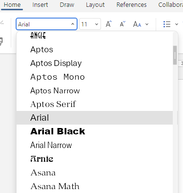
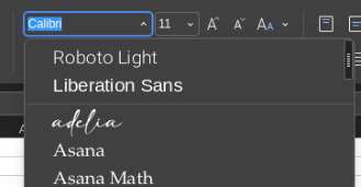
And in regards to Font Family Grouping, I see;
where they are grouped.
Edit: The grouping is limited to the summarising Regular, Bold, Italic, and Bold-Italic as a family though, as those variations are accessible via the “B” and “I” buttons on the toolbar.
So, at least for me, on the version and platform I am currently using, the features you are looking for appear to be present. So, your case may be tied to a specific version/OS instance.
Hi @arcqus,
It does look like you have the same Family grouping as is implemented on Windows; where the “Bold”, “Italic”, and “Bold-Italic” variants are grouped with “Regular”, at least, that is how it looks from your third screen-shot.
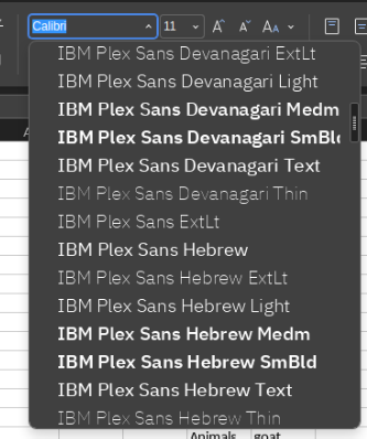
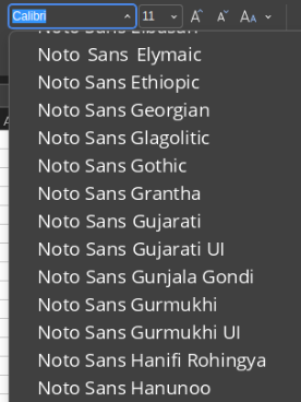
And your font list does look especially bloated.
Are you not allowed to remove the fonts that are unneeded? It looks like there is a lot of fonts for non-latin based alphabets there.
I Googled “Noto Sans Gujarati”, and it looks especially non-latin.
Hi @DavidRGreen
By grouping, I expect to have a meta-name (ei : Noto) and by clicking it, getting the list of “child” fonts.
To me, it is. All these IBMxx or Notoxx fonts are useless and they are in the way. They represent at least 60% of the listed fonts. Just useless clutter
They come with the install of Kubuntu. I’m no linux sysadmin and I tend not to uninstall things I can’t figure out what the exact impact will be.
I might give it a look, but getting a “pin font” option would be great.
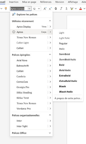
The font collection that Office/Word is doing in the screen-shot is clever, but to me it looks like they are doing on the basis of some specially coded rules, or an index table of “known” fonts, as the family.
What I see in the earlier screen-shot is;
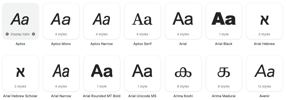
Aptos shows all fonts of that family as a group as indicated in the Windows Font manager, but
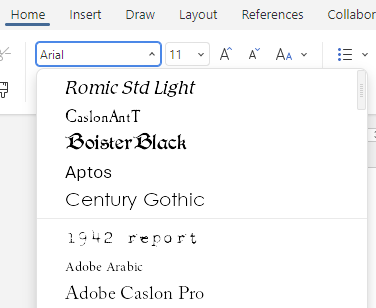
Calibri Light was split from Calibri family grouping.
This inconsistency makes no sense, unless there is a special process in place.
The cascading selector for fonts, as used in Office/Word does look good, and it would be an interesting implementation. I wonder if the OO developers would take it on?
Are you saying that you are seeing the recently used fonts at the top of the list followed by a fine line rule as a separator, but a better indicator would be a section header like in your Office/Word screen-shot would be better?
Your DejaVu point is interesting, but I think some splitting is justified; certainly “mono” and “serif” should not be grouped with “sans”, as they are too different from each other.
I like the “pinned” group of fonts. It would help to keep certain fonts at a “ready to use” position instead of being bumped out due to a unique usage, or just looking at a font in context to see suitability.
Something like Pinned, then Recent, the All in the list.
So, OnlyOffice, instead of Word or Google Docs, only allow to select the font, and the primary style (Italic, Bold, Bold Italic). It could be great if OnlyOffice also allow us to use the other styles.
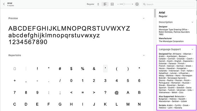
2. A font has some properties, like the language supported
In a TTF or OTF file (font file), there is a list of supported language by the font, for example and always in Apple Font Book for Arial :
So from my understanding, Microsoft Word and Google Docs are matching the font language with the language of the interface or the language of the document. This is why we see all those fonts in OnlyOffice, although they are unusable for our language.
Hello everyone @here!
Thank you for insightful discussion!
Just to summarize the mentioned suggestions:
A. Implement ‘pin a font’ feature (I tried to check it out at https://m365.cloud.microsoft/, but failed. Please point me to this feature there).
B. More explicit grouping of fonts similar to MS.
Following up on our discussion about fonts, here are three key suggestions:
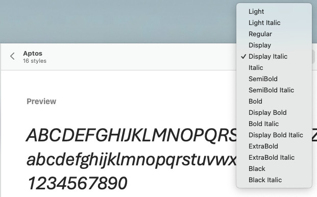
Display all styles within each font family.
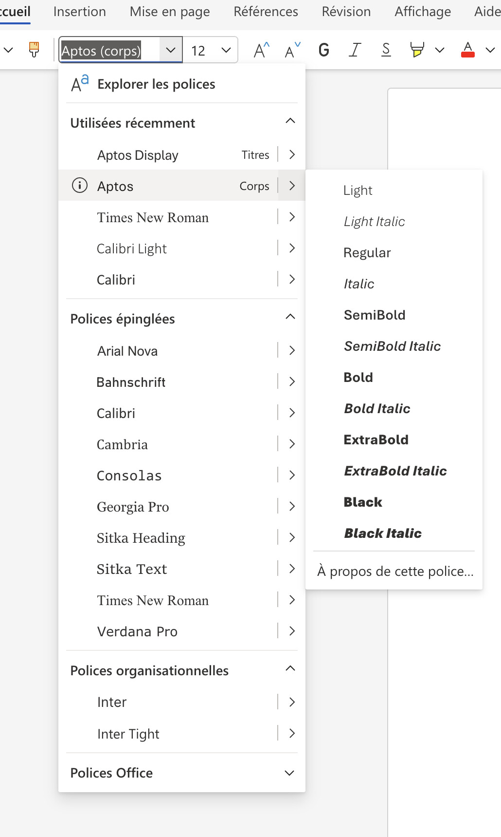
As shown in the screenshot below using the Aptos font, there is a limitation in how font styles are handled. While Aptos includes a wide range of variants (such as Light, SemiBold, or Black), OnlyOffice only provides access to the standard four: Regular, Bold, Italic, and Bold Italic.
The request: Enable support for all available font styles within the family, rather than just the basic four."
Filter out fonts incompatible with the current document language.
OnlyOffice already allows users to select the document language in the bottom-right corner. Since font files include language support data in their cmap field, it would be a significant UX improvement to filter the font list based on this metadata. This would ensure that only fonts supporting the current document’s language are displayed.
Refine the UI to better distinguish recently used fonts, most common font and the rest.
Currently, the font list only uses a simple horizontal line to separate recent fonts. I suggest replacing this with a more structured three-section hierarchy:
Recently Used: Displays the 5 most recently used fonts.
Common Fonts: A pinned selection of 10–12 standard fonts (e.g., Arial, Times New Roman, Verdana, Aptos).
All Fonts: The full list of fonts, filtered to match the document’s language.
The Font pinning suggestion made by @arcqus certainly sounds interesting, but like you, I could not see it on the Web App version of Word, so it must be a feature of the machine local executable. There are references to the feature online suggesting that the ‘pin’ appears next to the font name during a “hover event”.
But there is no doubt about the usefulness of the cascading font list. I can see a benefit in shrinking the font list from be bloated by all the UI fonts that the OS’s use and allegedly need; there is a forest of Segoe, MingLi, YaHei, JhengHei, Yu Gothic, and others; none of which I would consider using for document composition.