Hi all,
I recently moved to Linux and found OnlyOffice to be the best option with the cleanest UI that works very well. After using it a few month i have 3 things i could see improved. From most important to less here is my list
The icon where you can drag a field to fields below or above for copying the content to them is very hard to use. The choice between moving the field and copying the field is very finiky. I have to move the mouse back and forth so i get the right option. This is much much simpler on excel. The default in excel is the copy which i was also expecting it to do. Here the default seem to be moving the field. I rather have it as Office handles it. I believe (not sure), most expect this to copy the cell when you drag it.
When dragging the cell to other cells it does a nice job increasing the number as Excel does but with the difference that in excel it also gives you the option to copy only. Here i don’t get the same option. I tried to find it but didnt succeed. It would be great if there could be a popup that could give the user the option to simply copy which is what i wanted in my example.
(sorry could not add image due to being new user)
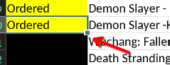
Search works great but not as expected. Say i filter my Console column to just PS5. I search for a game that i have both on my PS5 and Switch. The result even when filtered shows 2 instead of 1. So when i press the next it goes to a field that is hidden. I think this is wrong actually. Or atleast there should be an option to disable this. When filtered the result should be in what is shown i think.
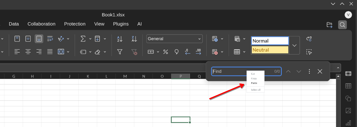
This is a minor but as you see the menu for right clicking inside the Find bar/window shows the menu out of place. Sometimes it is placed correctly but then again the size of the text (Cut/Copy/Paste) is very very tiny compared to the rest of the UI.
(sorry could not add image due to being new user)
Beside that i love the program. Very nice looking.
Thank you for the suggestions. May I ask you to create separate topics for each suggestion? This would help us to analyze each suggestion individually and avoid mixing up several discussions in a single topic.
For this one, you can keep any idea from the list and move other 3 as separate topics. It is up to you which one stays in this topic, but I assume it is easier to keep it straight and leave first suggestion:
Hello, sure i can do that. I thought since some are very small and pretty straight forward maybe its preferable like this but i can split them up if that helps.
Cheers
As I can see, two additional topics for items 2 and 3 were created. What about item number 4? Are you planning to create topic for it?
I did not spot any difference in behavior compared to named processor. Basically, you do not have to aim for a dot to move the cell, but instead you can hover your cursor over any border of the selected cell or array of cells to move it. You’ll notice that the cursor changes to navigation cursor with 4 arrows.
To copy values or extend an array you have to aim for the dot in bottom right corner. This is default behavior across all platforms as far as I know.
Hi, i read the release notes and i thought maybe this one was fixed but have not received the update through flatpak so wanted to wait and see before i post it.
Can you reproduce it on latest version? perhaps if you can confirm i can create one more post it if you want.
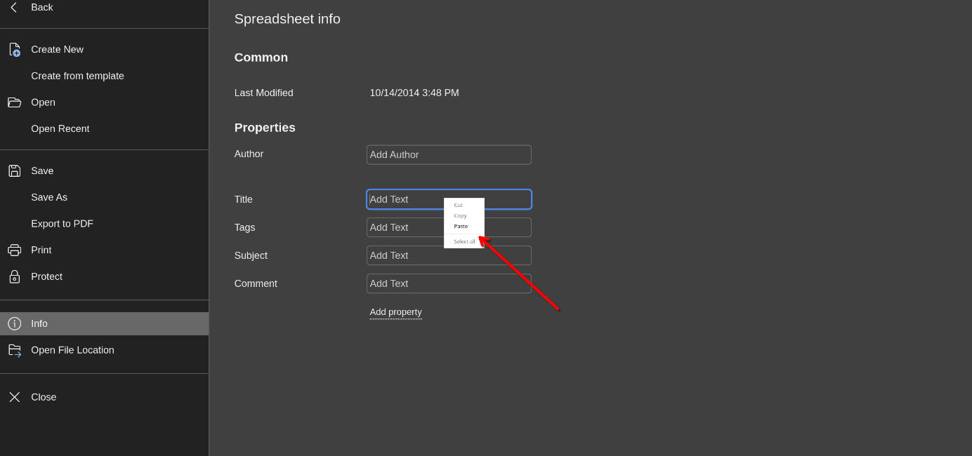
This seems to happen on every field, looks sooo small and tiny. I’m on a 27inch and its hard to read oven on my screen. Not impossible but the size and style don’t fit the rest of the app.
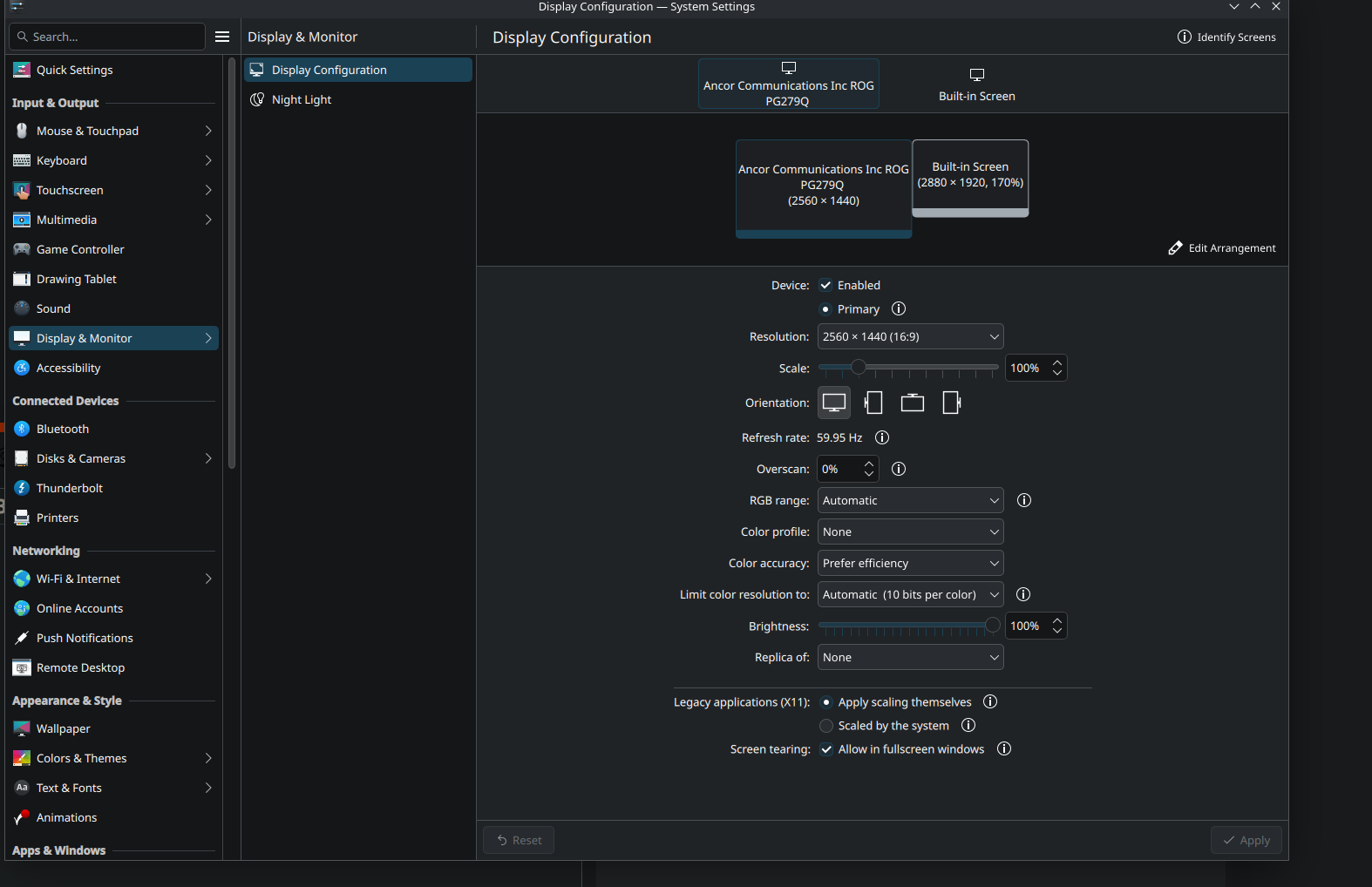
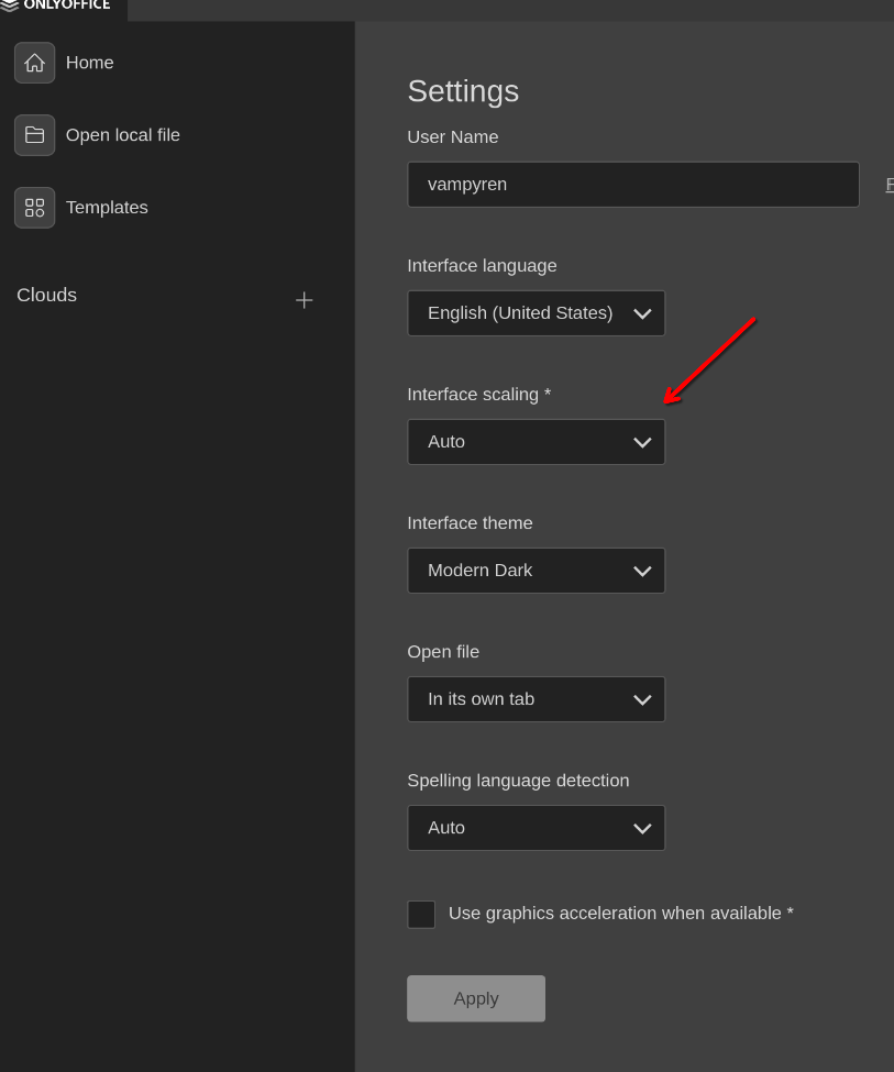
These are system settings, please check if any scaling is enabled for the app itself in from the main screen of Desktop Editors in Settings > Interface Scaling.
ah i see, it was on auto. Tested on 100% and same. Even at 250% everything gets bigger beside the ones i mention. I think this is something you render in your app to look nice for every field but you must have missed it in some paces like the one i show in picture.
I was able to find information in the internet, thanks. By the way, do you run Desktop Editors on that screen or on built-in display? I can see that for the built-in one you have 170% scaling – in terms of test may I ask you to see 100% for that screen too and check if the same issue occurs?
sorry have been extremly busy.
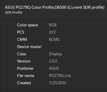
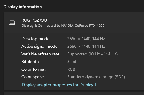
Yes running desktop edition and regular display. A Asus 1440p.
And went to try it again and now it works. I did change from Fedora to CachyOS so that might have something to do with it. Newer nvidia drivers among other things.
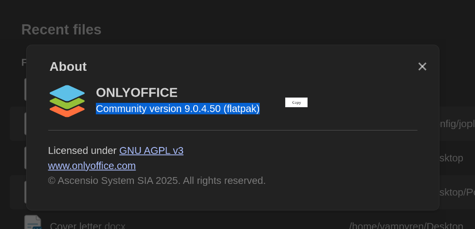
Community version 9.0.4.50 (deb)
I can’t reproduce it now so we can close it if you like.